
Startup · 0-to-1 Product + UX
A pickup experience that works across people, software, and hardware
Designing a faster pickup experience across the physical and digital journey.
- 0-to-1
- Service Design
- Physical + Digital
Pickup in under ten seconds, with no instructions needed.
Locker states and order states had to stay in sync.
Move complexity to the right layer
- My role
- Product direction, service design, UX/UI, creative direction, and startup operations.
- Scope
- 0-to-1 startup product · physical + digital service experience
- Context
- Featured · Startup · 0-to-1 Product + UX
01 — THE SITUATION
Where the work started.
Lavii aimed to make restaurant and delivery pickup safer, more secure, and dramatically faster using smart food lockers.
Customer
Needs a fast, obvious, low-friction pickup experience.
Operator
Needs visibility into orders, lockers, status, and exceptions.
System
Needs the physical locker and software to stay in sync.
The digital experience and physical locker behavior had to function as one coordinated system.
03 — THE REFRAME
The locker wasn’t the experience. The system around it was.
Design the interface for a smart food locker.
The starting point focused on the visible interaction with the locker.
The experience depended on customers, restaurant staff, software, notifications, and physical hardware working together.
A good pickup experience required the entire system to stay understandable, coordinated, and reliable.
02 — Understanding the system
Understanding the system
THE PICKUP JOURNEY
- 01Order placed
- 02Order prepared
- 03Locker assigned
- 04Customer notified
- 05Customer arrives
- 06Locker opens
- 07Pickup confirmed
WHO AND WHAT IT RUNS ON
- CustomerOrders, gets notified, arrives, and retrieves the food.
- Restaurant / operatorPrepares the order and hands it to a locker.
- Software / platformAssigns lockers, sends notifications, tracks state.
- Locker hardwareHolds the order, verifies pickup, and opens on cue.
Seeing the system clearly
The end-to-end pickup journey, from order placed to locker emptied.
The actor ecosystem: customer, restaurant staff, delivery driver, and operator.
Move complexity to the right layer
04 — PRODUCT DIRECTION
What that meant for the product
Each insight translated into a clearer product decision.
Pickup had to work without instructions.
Make the interaction obvious at a glance.
Customers needed confidence the correct locker would open.
Provide clear identity, status, and confirmation cues.
Staff needed to manage exceptions.
Give operators visibility and clear recovery paths.
Software and hardware states had to stay aligned.
Design around real system status, not only ideal flows.
05 — DESIGNING THE EXPERIENCE
One experience, multiple touchpoints.
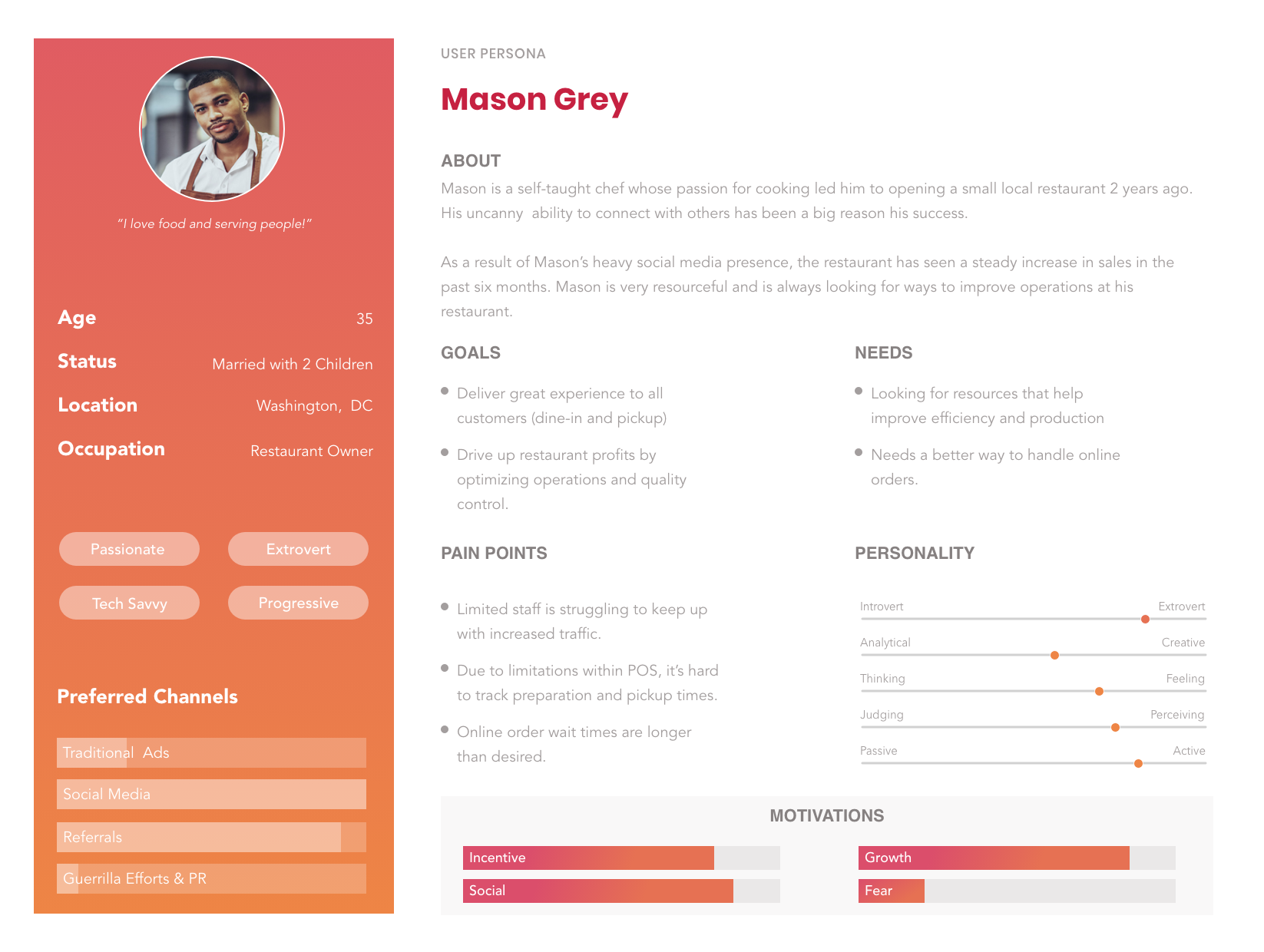
The same product decisions expressed across the locker, the customer’s phone, the in-store tablet, and the operator dashboard.
Arriving & identifying
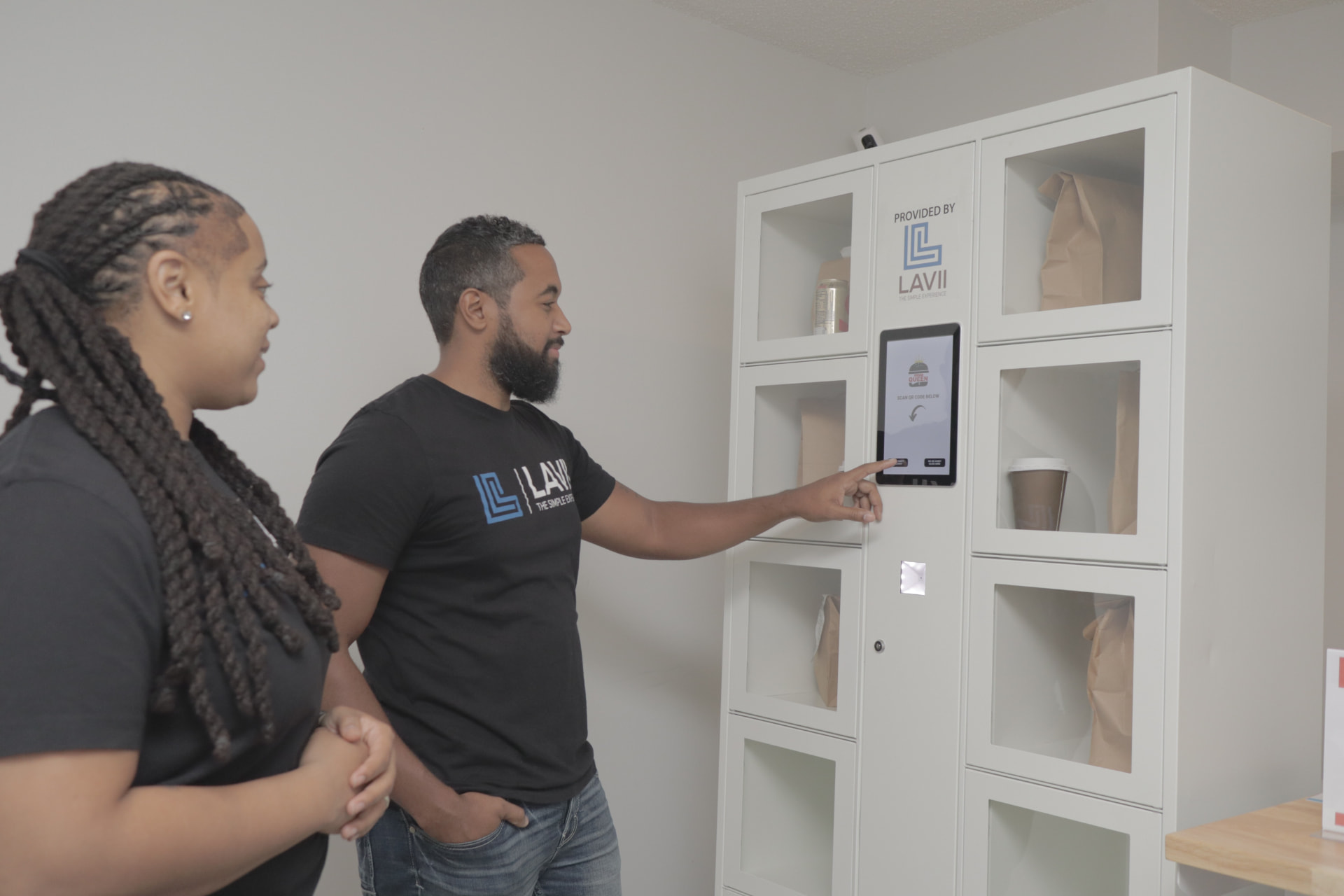
The locker face in service: a touchscreen prompt, a scan target, and clearly labeled compartments.
Arrival is the moment with the least patience, so identity and next action had to read instantly from a few feet away — no instructions, no menus.
Opening the locker
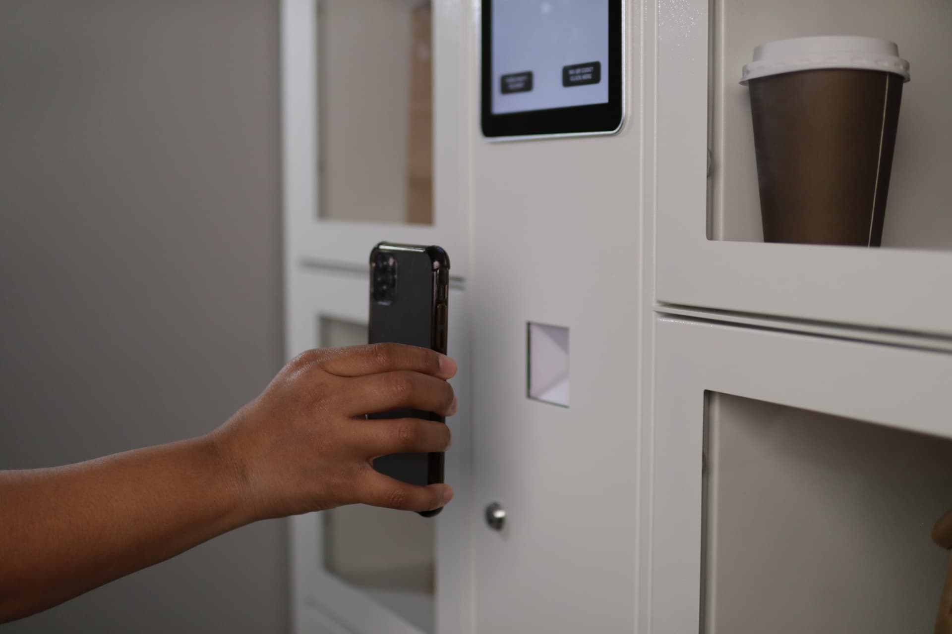
A customer at the locker, phone ready, with a prepared order waiting in an open compartment.
The door opening is the promise being kept, so every surface leads to one unambiguous state: this locker, this order, now open.
Managing orders
The in-store tablet where staff create an order, assign it to a locker, and hand it off during peak service.
Customer simplicity is produced here, so the operator surface favors large targets, a short queue view, and one obvious action per order.
Handling exceptions
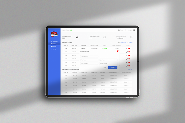
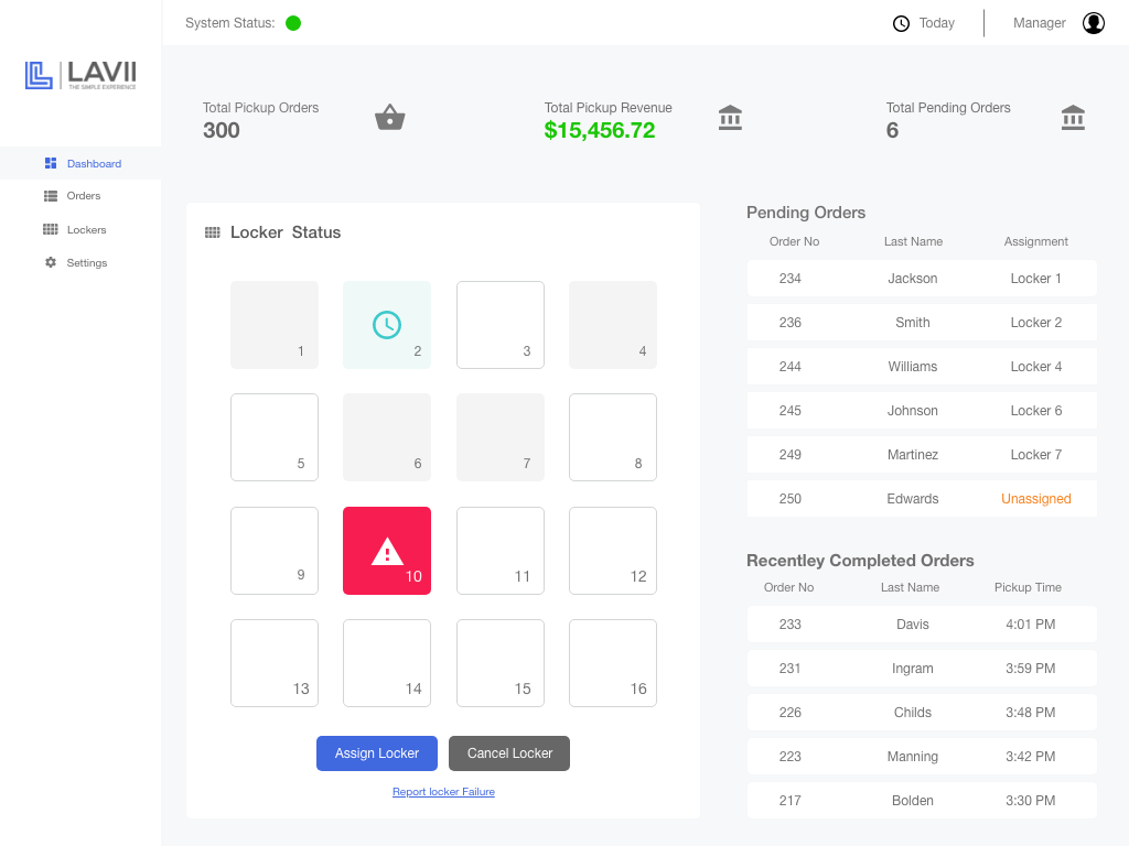
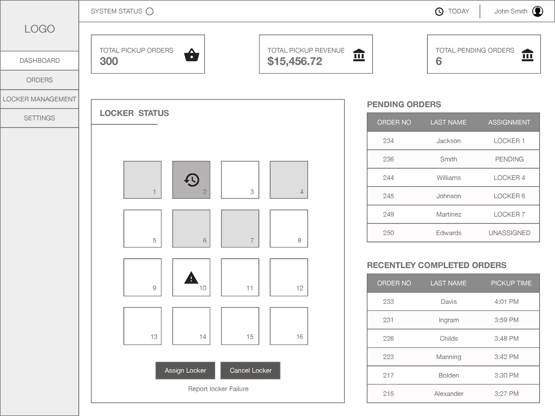
The operator dashboard: locker states, dwell time, pending handoffs, and completed pickups in one view.
Trust depends on the failure states, so the dashboard surfaces real system status — stuck orders, late pickups, unavailable lockers — with a recovery path attached.
Wider experience
Exploring the wider experience
06 — DECISIONS & OUTCOME
Key decisions
The product direction came from a few clear commitments about how the system should work.
Design for the full pickup journey, not just the screen
The experience began at the order and ended at an empty locker.
Make system status visible
Customers and staff both needed to trust what the system was doing.
Design for customers and operators together
Customer speed was produced by the operator workflow behind it.
Create recovery paths for when the ideal flow breaks
Real service conditions decided whether the system felt reliable.
The result
What changed
A clearer end-to-end service model.
A simpler, more understandable pickup experience.
Stronger operator visibility.
A more coherent relationship between hardware and software.
The simplest customer experiences are often supported by the most thoughtful systems behind them.
More work
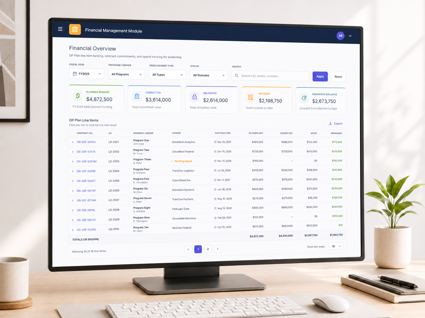
Enterprise platform · Strategy + UX/Product Design
From “build us a tracker” to a clearer operational system
From “build us a tracker” to a clearer operational system..
View case study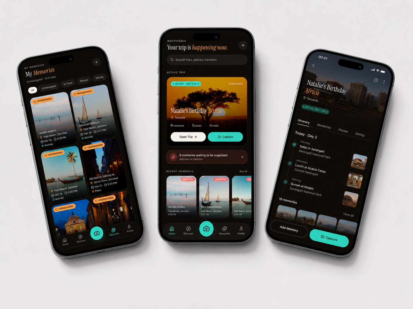
Self-initiated · Consumer Mobile Product
Where past trips become the starting point for what comes next
Wayphoria is a travel platform built around real trips, connecting the places, decisions, experiences, and memories of one traveler with the inspiration and planning needs of another..
View case study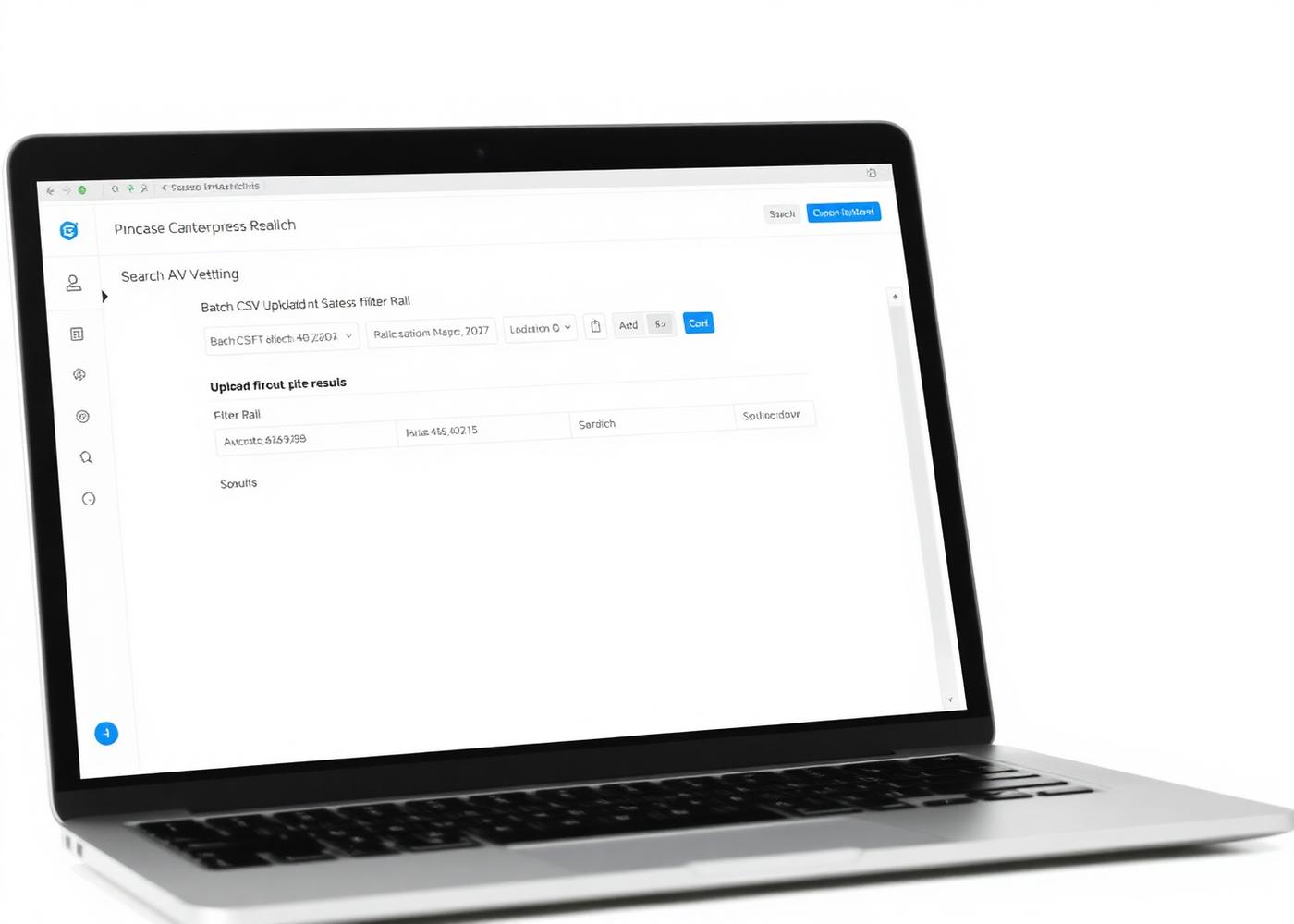
Enterprise tool · UX/Product Design
Making a high-volume research workflow easier to navigate and trust
Making a high-volume research workflow easier to navigate and trust..
View case study